
My Clients
In Their words
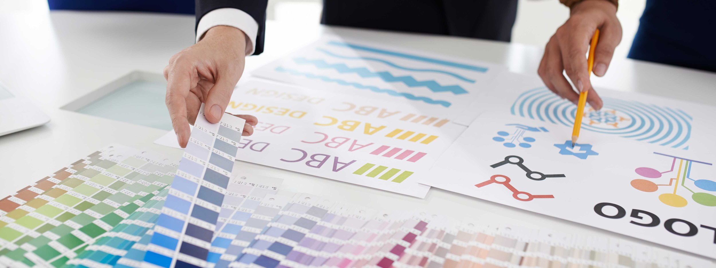
Design That Speaks Beyond the Screen
Real stories from those I’ve had the honor to create for.
Every project begins with a story—someone’s vision, dream, or mission waiting to take shape. What I value most isn’t just the final design, but the relationships formed along the way. Below are the words of clients who trusted me to bring their ideas to life. Their success and satisfaction are the truest reflection of what Scott W Bailey Design is all about: creative partnership, meaningful communication, and results that make a difference.

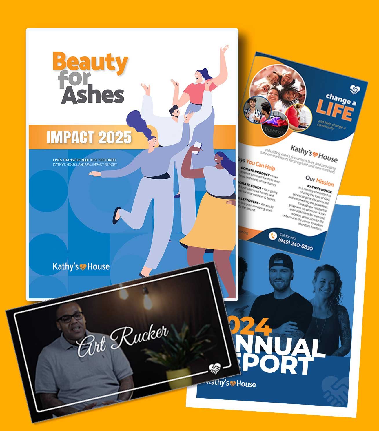
Complete Branding, websites, videos, print collateral
Jon Phillips • CEO / Executive Director
Date: 2010 - 2025
Project: Various branding concepts and updates, print collateral, web, and video projects
Kathy’s House is a faith-based residential program dedicated to helping men and women rebuild their lives through recovery, purpose, and hope.
Project Summary: Originally launched as a women’s shelter in 2010, Kathy’s House partnered with me to develop their branding, website, and print materials. As the ministry expanded to serve both men and women, I was brought back to refresh their entire visual identity — from brand and style guides to website design, video production, flyers, and their annual report.

“Much more than a graphic designer.”
Scott Bailey is truly top of the class. He took our tangled ideas about rebranding and transformed them into a clear, powerful identity we’re proud of from top to bottom. Scott is so much more than a graphic designer — his vision and creativity come from a deep well of experience and genuine care. Our partnership with Scott is for life. We couldn’t be more pleased.
— Jon Phillips, Executive Director, Kathy’s House, Inc.
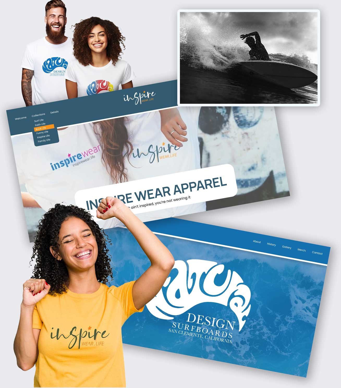
branding, website, t-shirts

Gregg Lancer • Owner Operator
Date: 2024 - 2025
Project: Branding, logos, websites, and t-shirts for two companies
InspireWear.Life is a print-on-demand t-shirt and apparel company, and Natural Design Surf was his Father-in-Law’s surf brand that Gregg wanted to resurrect to honor his father.
Project Summary: The project began with the idea to honor the Natural Design Surf brand and surfboard shop by reviving the brand and creating a website to showcase its history. This then grew to a second company branding, website, and t-shirt designs to sell merchandise and additional designs.

“Beyond Expectations — Twice!”
Even with a wealth of instructional videos on YouTube and the availability of AI tools, I still found myself struggling to create a truly professional-looking website. That’s when I turned to Scott — and I’m so glad I did.
Scott not only brought creative ideas I never would have thought of, but he also went above and beyond — even taking time long after the project was finished to help me over the phone with updates and to ensure I understood how to manage my site going forward.
He’s professional, skilled, patient, and incredibly easy to work with. His kindness and enthusiasm made the whole process fun! The finished product exceeded all my expectations — I get constant compliments on my website.
But wait, there’s more — I was so impressed that I hired Scott again for my second website, which turned out every bit as excellent as the first. I’m beyond grateful for his help and proud to show off both sites. I truly feel blessed by Scott and the part he played in making this all happen.
— Gregg Lancer, InspireWear.life | NaturalDesignSurf.com
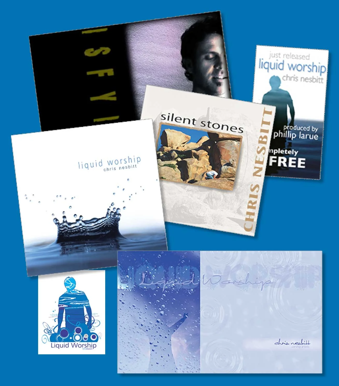
Album release, full branding, and developing marketing material

Chris Nesbitt • President
Date: 2004 - 2008
Project: Branding, collateral, press kits, albums artwork, promo videos
Chris Nesbitt, a rising Christian artist and worship leader, partnered with me to launch his debut album, Silent Stones, and later his follow-up project, Liquid Worship.
Project Summary: Chris needed complete creative direction across multiple album releases — including branding, album design, full promotional marketing kits, and video and DVD media for radio and TV. Through on-location photo and video shoots, we captured the heart and visual identity of his music, bringing his message to life across every platform.

“Scott sees both the big picture and the details.”
Better than anyone I know, Scott has the unique ability to see both the big picture and the details. His creative eye is spot-on, and he seems to intuitively know where you want to go and how to get there. Scott delivered more bull’s-eyes in one hour than most designers could produce in several days. Throughout the entire project, his professionalism and communication were second to none. I look forward to working with him again and again.
— Chris Nesbitt, President, Sounds Pacific Publishing Company
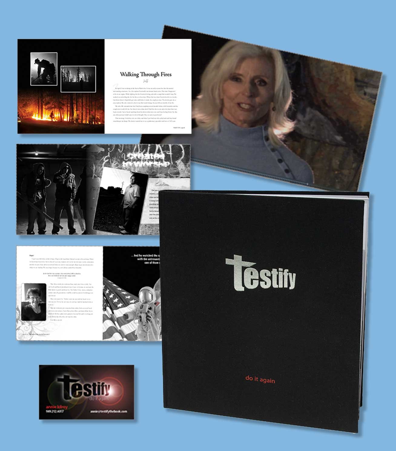
Coffee Table book, marketing pieces, video, website


Annie Kilroy • Publisher / Author
Date: 2010 - 2015
Project: Design and Illustrate Coffee Table Book, Brand, Fliers, Banners, Marketing Video, DVD, Website
Annie had experienced and received a miracle healing of MRSA and felt compelled to give back to God a book of other miraculous stories.
Project Summary: Annie Kilroy envisioned a book that would bring together powerful testimonies of miracles — stories of transformed lives, including her own. I presented the concept of transforming her vision into a high-end, hardcover coffee table book filled with stunning illustrations, inviting readers to pick it up and be inspired. The finished book was a huge success, featuring 22 stories (including mine) and supported by a complete marketing suite — from flyers, videos, and slideshows to a launch website and promotional materials.

“Passionate, Professional, and Produces Exquisite Results”
When I first met Scott, I knew immediately he was the one to bring my dream of a testimony book to life. From the start, his creative vision and sample illustrations perfectly captured the heart behind the project. The final book was absolutely breathtaking. If you want your dream to become reality, let Scott run with it — you won’t be sorry.
Annie Kilroy, President, Declaration Publishing
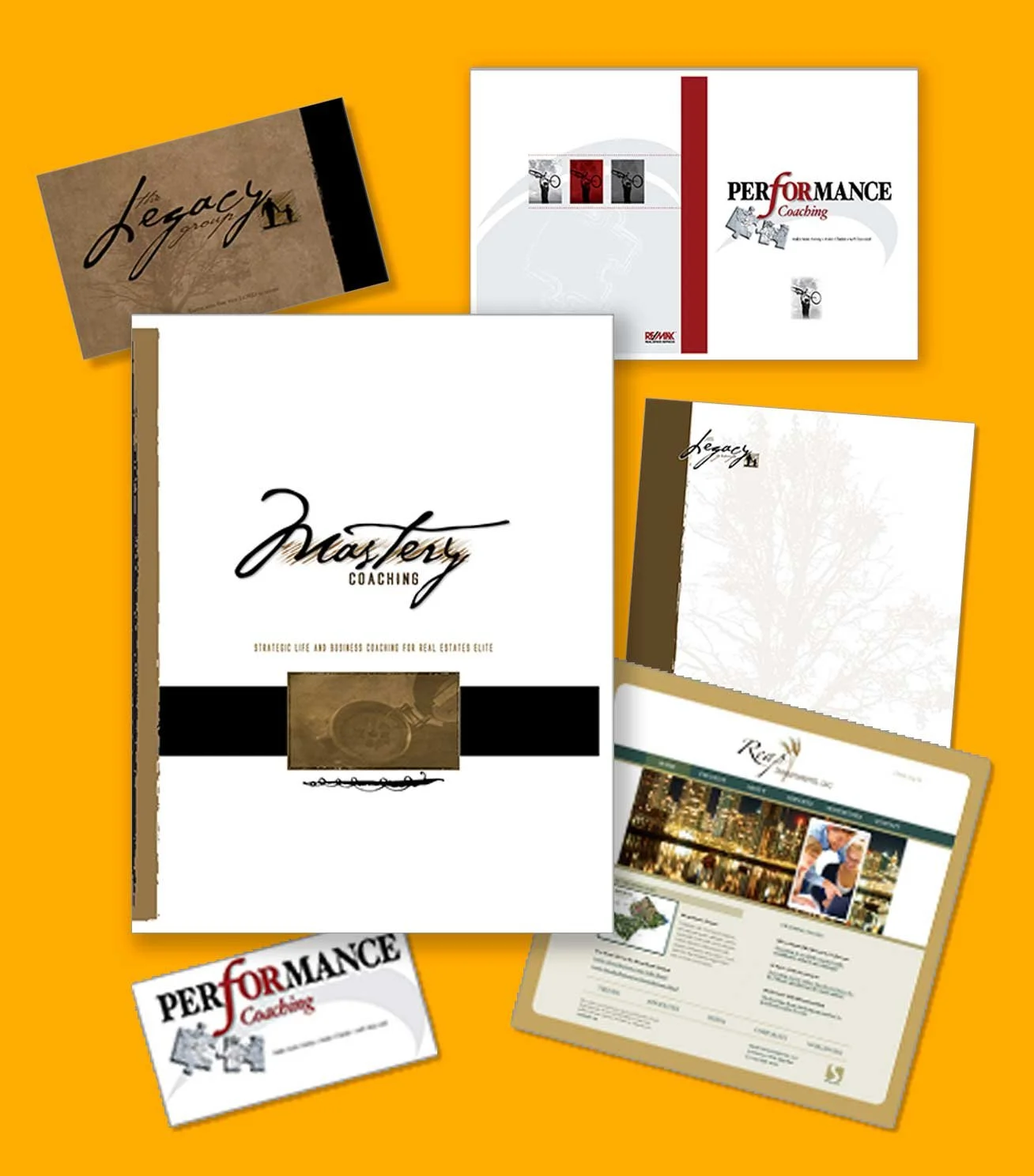
Complete Branding, websites, print collateral


Christian L Pollinger • Director of Business Coaching, RE/MAX Real Estate Services
Date: 2010 - 2017
Project: Branding 4 business entities, including all collateral material, and a website
A respected leader in real estate coaching, Chris Pollinger of RE/MAX Real Estate Services sought to redefine his brand with a look that reflected both innovation and integrity.
Project Summary: Chris wanted to take his RE/MAX coaching operations in a bold new direction — one that was cutting-edge, thoughtful, and reflective of his faith. Together, we developed branding and collateral for four distinct business entities, creating a cohesive visual identity that unified his professional reach while elevating his brand presence across the West Coast.

“After working with Scott, I have not recommended another.”
I’ve worked with dozens of designers and advertising agencies to coordinate hundreds of branding packages and marketing campaigns for agents and brokers across the real estate field. After working with Scott and SWB Graphix, I haven’t recommended another.
Scott’s ideas are fresh, insightful, and—most importantly—profitable. He seamlessly blends creativity and strategy to ensure his clients not only get the look they want, but also designs that truly work for their business. His branding and campaigns have been key catalysts in the explosive growth of our organization.
— Christian L. Pollinger, Director of Business Coaching, RE/MAX Real Estate Services
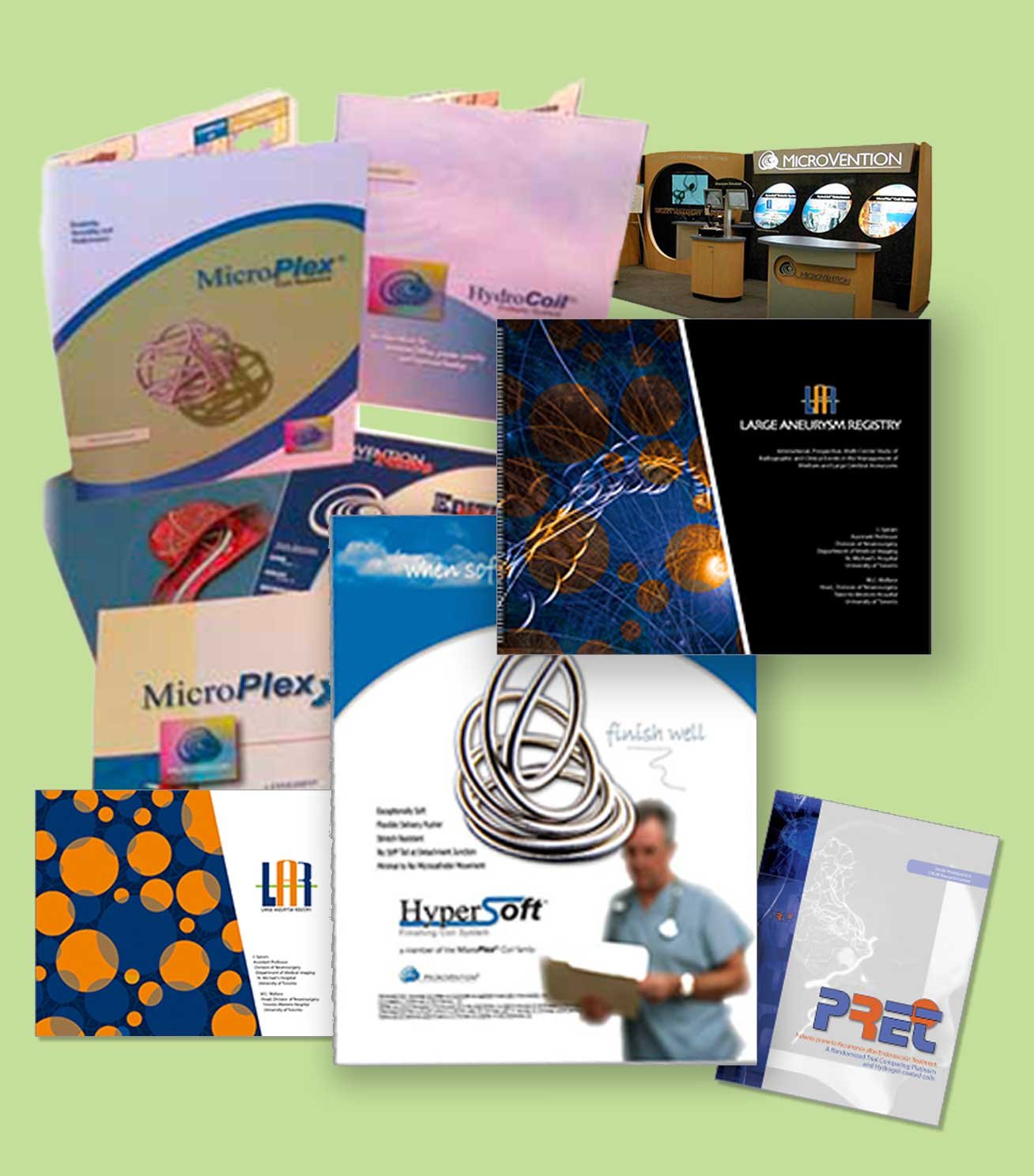
Company branding, product brochures, t-shirts, trade booths


Glenn Latham • Director of Worldwide Marketing
Date: 2001 - 2006
Project: Marketing collateral from brochures, fliers, t-shirts, booths, videos, and much more.
Sometimes the right opportunity comes when you least expect it. What began as a single design request quickly grew into a five-year partnership with MicroVention—a leading global medical device company
Project Summary: In preparation for the worldwide launch of a groundbreaking medical device, MicroVention needed a full suite of branding and marketing collateral—from brochures and trade show booths to videos, t-shirts, and more.
After being recommended to Glenn Latham, I initially hesitated, explaining that I was a self-taught designer running a successful landscape business—not the seasoned agency professional he was likely seeking. Glenn appreciated my honesty but persisted, inviting me in two weeks later. After our meeting, he asked if I could design a t-shirt that his current team had been struggling to deliver. I returned three days later with seven designs. That moment marked the beginning of a five-year creative partnership, contributing to one of MicroVention’s most successful product launches worldwide.

“I appreciate the depth of creative talent he brings to challenging jobs.”
Scott initially worked as an outside consultant, developing graphic materials for product literature and trade show exhibits. His creative talent and design insight quickly earned him greater responsibilities at MicroVention, leading to his hiring as a full-time member of our marketing team in 2004–2006.
During this period, MicroVention experienced 50% annual revenue growth—a testament to the effectiveness of the marketing materials Scott helped create for both direct and distributor sales teams worldwide.
I truly enjoyed working with Scott and greatly appreciate the depth of creative talent he brings to every challenging project. I would gladly recommend him to any organization seeking exceptional design expertise.
— Glenn Latham, Director of Worldwide Marketing, MicroVention
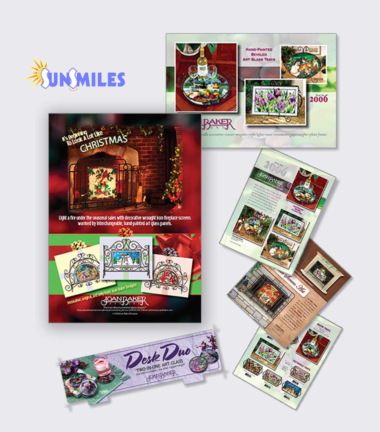
Catalogs, magazine ads, sales brochures

Linda Baker Kaahanui • Executive Director
Date: 2003 - 2010
Project: Magazine ads, catalogs and inserts, marketing inserts, postcards and sales sheets
Some collaborations are built on trust and friendship that span years — and Joan Baker Designs is one of those. Working alongside Linda Baker Kaahanui, I had the privilege of supporting their nationally recognized brand through countless creative projects, tight deadlines, and global collaborations.
Project Summary: Linda managed national and international operations for Joan Baker Designs, overseeing a wide range of marketing and catalog projects. Many of these involved complex coordination, tight turnarounds, and overseas production schedules. Together, we consistently met — and often exceeded — expectations, delivering polished, on-brand materials under demanding timelines.

“Scott has been a lifesaver on projects that were due yesterday.”
Scott has truly been a lifesaver on projects that were due yesterday. It’s such a relief to work with someone who can produce winning results, even under intense time pressure. I know what it’s like to struggle through endless rounds of corrections, but with Scott, that’s never the case — he gets it right the first time. He’s a true professional who makes my job so much easier!
— Linda Kaahanui, Joan Baker Designs
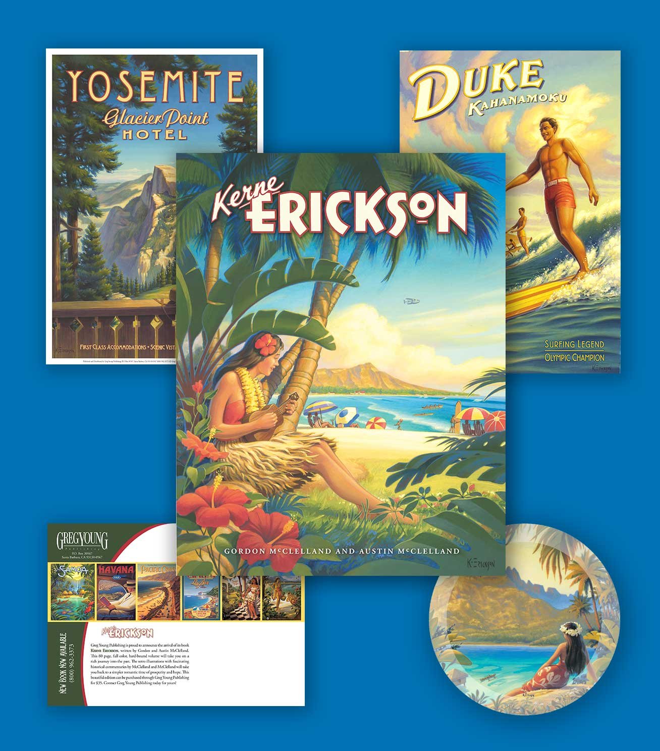
coffee table book, marketing and promotional material


Greg Young • President
Date: 2013 - 2016
Project: Kerne Erickson Book, Marketing material, posters, show invites, postcards, and collateral
When Greg Young Publishing set out to produce a collector’s coffee table book featuring the iconic retro travel poster art of Kerne Erickson, I was invited to help bring the project to life. Together, we crafted a beautifully designed volume celebrating each artwork and its story, supported by a full suite of marketing materials — from posters and postcards to show invitations and promotional collateral.
Project Summary: Kerne Erickson Book, Marketing material for the book including posters, show invites, postcards, and collateral.

“Impeccable taste and complete confidence.”
Scott Bailey completed every task we needed with impeccable taste and attention to detail. His decision-making was spot on, and he was an absolute pleasure to work with throughout the entire project. I felt completely confident placing our new book in his hands, and the results exceeded expectations.
Working with Scott was not only productive but genuinely enjoyable. I look forward to partnering with him again on future projects.
— Greg Young, President, Greg Young Publishing